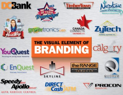
Branding - THE Key Visual Element
Over the past several years, the term “branding” has evolved into a somewhat different animal. So, let’s first clarify then, the difference between the broader term of branding as it’s come to be known, and the more readily identifiable elements of an organization’s visual identity or “logo”, which will be the primary focus of this discussion. Branding in the broad sense, is the way an organization differentiates itself from its competition on ALL levels – establishing its identity, developing its values, promises and culture, and ultimately, by its interaction with customers and prospects. And yes, the company’s corporate identity or logo is THE key visual element in branding.
Long-term, a professional, insightful and relevant logo can build recognition and loyalty while creating an emotional connection to prospects, clients and stakeholders. If a corporate identity or logo appears as though it was generated on a napkin by your friend’s aunt Edna over several cocktails while discussing the aforementioned election promises, it may not be producing the desired results. Nothing against aunt Edna, but if her creative expertise is the result of a lifetime of really swell flower arranging and knitting tea cozies, the business should really seek professional help. Unfortunately, “really swell” doesn’t quite cut it when it comes to the face pasted on a business.
So how do we ultimately arrive at the visual component of a brand that best represents the company, and why do we brand at all? I’m often asked why companies should invest the time, resources and finances in a visual branding program. The short answer is it’s a competitive world and companies cannot afford to have lesser “visual” standing than their competition when it comes to perception, regardless of the company’s ability to deliver high quality goods or services. Organizations that employ great people and have great products or services, but are far less than great when it comes to the way they are perceived are neither gaining any visual edge over their competition nor maximizing their ability to flourish and gain market share.
For support organizations and not-for-profits that may not live in the “competitive” arena, it becomes more about how they are perceived by the groups, companies or stakeholders they serve or are served by, in addition to public or government interests. If they are not perceived as professional and viable, support, whether financial or otherwise, can be harder to come by.
Design Requirements
A well-designed logo should evoke an emotional response from its viewers. It should be clear what service or product the company provides either by use of its graphic element(s), name itself or should the first two requirements not be met, a descriptive tag-line.
With few exceptions, the logo should be stylistically tied to the industry it represents – a skateboard shop logo for instance, will generally have a much different visual approach than a law firm, through its use of graphics, colour and fonts. Unless the organization plans on updating or re-branding regularly, the logo should certainly look modern, but not trendy. Following trends is like following fashion. The logo may look timely and great short-term but will become style-dated even faster. Design that is professional and with a clear message should stand the test of time.
Much like art, any exercise in the “visual” component to branding carries with it a certain level of subjectivity and personal taste that seems to increase proportionately with the number of eyes involved. With this in mind, the logo should ultimately reflect the values and identity of the person with the most at stake, and who makes the final decision. The old adage of “there are no statues of committees” still holds true.
Is your company visually “dressed” for success?
Perhaps ask yourself the following questions:
- Has your business moved into the 21st century while your brand is still wearing those “hip” duds from the 70s?
- Do you sometimes feel like a small fish in a big ocean?
- Did your brother’s friend’s cousin Morty (or aunt Edna) scribble an idea for your logo on a paper towel all those years ago, and you’ve been too busy to upgrade to something more professional?
- Do you wonder if your business is wielding a pea-shooter in a gun fight?
- Did your company graduate with honours from the University of Amazing, yet receive only a 6th grade diploma in branding?
- It’s a dog-eat-dog corporate world out there and there’s always a bigger, louder, more attractive “dog” strutting itself past potential and existing clients – same one who has won best in class and now sits arrogantly atop the corporate perch. Are you getting your share of the “kibble”?
If you said “yes” to any of these questions, your business may be suffering from what is referred to as “Brandis Invisibilus”, “Brandis Osaurus” or even worse, “Brandis Failus”. All right, some liberties may have been taken with these terms, but the point remains!
So, what steps does one take to stop the ship from sinking? Perhaps it’s time to recognize that the visual appeal of your business is now more critical than ever, given the challenging times we live in. You may be in need of a corporate “makeover”. Because, much like the way we are perceived, the way your business is perceived could determine whether you look like a legitimate, professional organization or something else entirely. What organization should hang their hat on aunt Edna’s creative flair, when experienced, professional help is available?
Robin Albright
Senior Advisor
